Thursday, March 27, 2014

A03 Modifications, Pt. 1

After seeing the other students' work yesterday, I found a lot of the pieces really great and wanted to try out some things that I saw in their work. Tonight, I spent a couple hours working on making a panel out of the top face instead of one of the side faces. I was also considering also making part of one of the adjacent faces a screen as though the bubbles were edging down the the side of the box but decided to pass on it tonight. I also crucially included the structural screen this time, which, although I felt was a good decision to forgo in yesterday's project, gave the space a whole new impression of layering and transparency, emphasizing the bubble concept.

Surrounding box removed and replaced with four poles to see the full extent of the shadows and to make the whole thing less bulky-looking.


This one was done last and is the same view as the one before, but I messed around with other renderings and settings before going back to change the screen pattern and remove some of the bubbles so I couldn't figure out how to get the sun and shadows back to the previous one. It was a little frustrating but I decided to make the best of it and explore how changing the azimuth/angle of the sun and time of day would affect the darkness and clarity of the shadows.


Clarity and distortion of the shadows explored by changing the sun settings.

I also want to try modding and screening the three exposed long faces of the box, like NL did on his tunnel-like screen, and changing the shape of the prism by curving or rounding one side like AB did to emphasize a flowing motion. Some other time!

Wednesday, March 26, 2014

A03 - Inspiration from Nature


Description: Project A03, which I titled "modular screen system," was introduced as a short one/two week project to put our paneling tools skills to work. We were instructed to take one side of a rectangular prism and distort the flat panel into a curvilinear wave-like form and then construct grid panels along the surface. The grid panels were then offset on the outside to provide a base grid for a custom 3D paneling system and on the inside to provide support for a framework of partitions. Finally, we were to selectively remove panels from the surface to form interesting shapes and shadows displayed through a V-ray rendered viewpoint from inside the box. 

From the beginning, I knew I wanted to create something whimsical rather than the sharp and angular surfaces we had made with the pre-made custom grids in Rhino. I decided on round shapes, either spheres or rings, and looked to nature for inspiration - initial ideas included dandelion fluff and cherry blossom flower petals. I eventually settled on the idea of bubbles created by gentle waves in calm water, like when you push your hand through water and the rippling that follows is accompanied by flourishing bubbles beneath the surface. The gentle curve of the modified plane also added to the concept, and I finished up the surface look by removing individual rings in the paneling system rather than whole groups that were used to make the screen. The final effect was of randomly grouped patches of bubbles that imitated what it might look like from underwater with the dappled light in the shadows. I declined to include the partition since I wanted the impression to be of free-flowing space in between the interior and exterior while the bubble-like rings provided a whimsical threshold. 

Thoughts: Extremely pleased with this one! Once again probably spent more time on it than I should have by procrastinating on studio work, but I definitely think it was worth it. I'll probably change the alignment of captions, contour of the waveform, and maybe do a closeup of the partition screen, but I'm pretty happy with it otherwise. I learned a lot about how to use Illustrator with the background of this board but would still like to know how to do things more quickly; perhaps it might get better with more practice?

I encountered some problems, mostly with the rendering of the rings since I had a very specific image that I wanted to be able to create in the rendered perspective. As I said in class, I had the idea of the screen being physically constructed from some hard transparent or translucent clear plastic material, like bubble wrap but less flimsy without losing it's "bubbly" texture. However, I couldn't figure out how to get the right material with the right reflectiveness/transparency for that effect, even after I messed around with the settings in the Environment and visMatEd tabs in V-ray. I also tried using more iridescent or lightly colored materials, but I think the actual reflective and transparent quality of the effect I'm looking for has to be obtained from messing with the lighting settings on the renderer. I think maybe that comes with more knowledge of what each setting does, but also with actively seeking out assistance/tutorials. Some day when I have more time.

Monday, March 24, 2014

Progress on A03

I wanted bubbles/dandelion fluff but I ended up with cheerios/donuts............not really sure how I feel about it but it's definitely not what I was going for. Maybe rendering it with different textures in Rhino/Photoshop might help...


Thursday, March 20, 2014

A02 - Laser Cut Cube 2.0

After the last cube's waffling technique didn't quite work out in reality, I spent some time re-slicing the whole thing in Rhino and laser cut a whole new cube. Here it is!


I'm pretty psyched. I like the way it out turned out a lot, and it's a lot steadier than I thought it might be as well! There's only a bare minimum amount of glue on the model (on the thin rod in the third picture holding the parking-garage-like slices together at the meeting points). I'm still planning on fixing up and maybe gluing down some of the slices even though they look pretty good so I can take some well-lit photos for a portfolio piece.


SQUEEEEEEEEE!

Thursday, March 13, 2014

Rhino Render/Photoshop Tutorial


Yesterday, we were given a tutorial in class on how to use Rhino and the V-Ray rendering tools to create more realistic looking renders in preparation for the next project. I made my perforated wall a little too thick since I was trying to keep up with the tutorial, but I'm sure the actual wall I make won't have the wrong proportions. I kept up with the Rhino stuff pretty easily (although I'm not entirely sure why my sky isn't as blue as other people's seemed to be), but I got tripped up a little on the Photoshop part. I think I'm not as familiar with Photoshop as I am with Rhino, so I'll probably have to take some extra time to fiddle with all the layers and adjustments when I'm actually working on the project.

Wednesday, March 12, 2014

Rendered Custom 3D Panels

I just took a couple minutes before and at the beginning of class to make some quick renders of the four custom 3D panels!


Tuesday, March 11, 2014

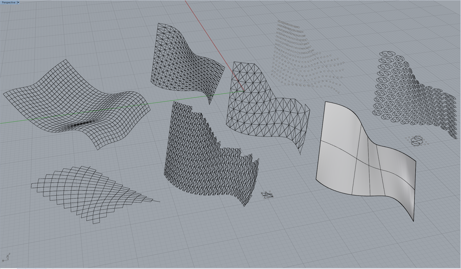
E02 - !!!!!!!!!! (Paneling Tools)

This is SO COOL.


Fun shapes made using Loft (with closed and open curves), Solid Paraboloid, Pipe, and Twist.

Custom grid panels (assuming that means only grid points and no lines or superimposition on surfaces) using ptGridSurfaceDomain, ptGridExtrude2, and ptGridUCurves. I experimented with different grid methods (number, arclength) and number of spans in the U/V direction to create denser or sparser grids.

Custom 2D panels with a couple of the curves from the previous studies and repetitions on one of the original lofted surfaces, some using the default patterns and some with patterns that I made myself. I also took some time to experiment with the different types of ptGridCurve options and discovered that some of the grids came out more or less formfitting than others.

Most exciting! Custom 3D panels with grid panels made from the original fun shapes and using 3D fills like tubes, cubes, and spheres. Same rules of experimentation applied, including offset distance and fill sizes!

Monday, March 10, 2014

Introduction to Paneling Tools

also titled "holy $#*% how did i do that?! that looks AWESOME!"

Spent today's class on tutorials about paneling tools and making custom grids.

Wednesday, March 5, 2014

Ordo Ab Chao - A02 Review

The last few days have been a whirlwind of snow days, early birthday celebrations, Gugalun House drafting and confusing MoveFace demands in Rhino. Nevertheless, I came up with a design for my waffle cube that I'm actually quite fond of, despite having a few potential flaws. I like the concept but will need to fix a few things before I can declare it finished. Thoughts first this time. 

First off, it is nearly impossible to construct from the way it is currently designed. I placed the section cuts way too close to the edges, causing extremely tenuous holds that ended up either falling over or ripping. I struggled a lot right off the bat trying to fit pieces into each other without ripping the delicate holds. Unfortunately, I eventually ended up having to take an x-acto knife to some of the closed off notches due to problem number 2...


Case in point.


Second, I failed to take into account that just because something looks like it waffles perfectly in Rhino does not mean that you will be able to slide the pieces together perfectly to build it. I had a lot of cases where the slots were too small for the pieces to fit through because while the waffle notch at that section cut fit the cross piece perfectly, either one or both sides of the piece were too big to fit into the notch to slide through. I ended up only being able to fit a few slices into each other while the others wouldn't make it all the way through. 


Here lie the charred and straggly remains of the great chipboard battle of 3/5/14

On the bright side, I'm quite positive that fixing the section distances and slices will result in a stable cube. I tried to focus on two main forms of cross waffling but also used a small section of rounded slices to emphasize the cylindrical volume in the corner. I also decided to use the radial donut in order to elevate the wirecut section of the cube. One criticism that came up in class for several people was the unintentional existence of the "boring" side of the cube (my cube unfortunately also falls into this trap).


Description: Project 2 demanded utilization of newly learned Rhino skills to contour and waffle cut the cube from Project 1 and render the design diagrams using the V-ray plugin. "Clever"/efficient waffle cutting of the cube was desired, as we were not allowed to use adhesives to keep the slices together. After figuring out the waffle cuts in Rhino, we were taught how to use the laser cutter to manifest the physical shapes in chipboard and were instructed to put together the approx 5"x5"x5" cube. For the final presentation board, we used the rendering skills to highlight the different components of the waffle cut cube and to diagram the most important concepts that the laser cut cube or the project 1 cube had to offer as well as each individual slice of the waffled cube.